ADVANCE TYPOGRAPHY - TASK 3: TYPE EXPLORATION & APPLICATION
ADVANCE TYPOGRAPHY - TASK 3: TYPE EXPLORATION & APPLICATION
July 20,2024
15/5/2024- 29/5/2024 (week 8- week 13)
Tyra Franchesca Valerie Anthony (0368223)
Advance Typography/ Bachelor of Design (Hons) in Creative Media
Task 3- Type Exploration & Application
Lectures
advance-typography.html\
advance-typography-task-2-key-artwork.html
INSTRUCTIONS
TASK 3
Fig 1 Proposal
Proposal Idea:
For the proposal I choose the first topic to go with from my issues above there are many ancient Greek lettering out their but i will have to make mine unique and using element from Greek Methodology that also help me understand more and what i want to show and see, so i came with the idea of creating a Greek font by applying symbols within my letters that will make it unique.
Process:
Adobe Illustrator
The first step before starting to create my letters is by looking for references with the same as I want to go with greek-freak.font this is my reference for my lettering. Was not the same as i want but it will do, my plan is to get a unique balance between the letters which i was having difficulties with.

Fig 1.1 First attempt

Fig 1.2 Second attempt
On the second attempt, I was trying to find how to well balance and make the fonts look the same repetitive with the same structure i have started with. As the above photo is the bold and thick letter font which am going with but without the pointed edges but with a squared edge instead.
Explanations:
As take references from an exciting font just making my own adjustments to on how i imagine it was having difficulties at first trying to make the shapes and balancing the proportion to make all of the font follow.
Most lettering are unique and simple not complicated i was went with the same alternative but focusing more on how appealing and straight forward.
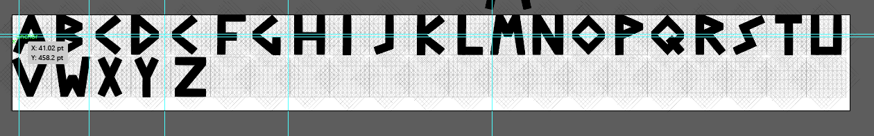
Fig 1.3 Refining the letters
The finalization of my typeface:
Picture 1 was the beginning of finding the right proportion of the typeface which i was having difficulties with to make it well balance with well structure of the fonts.
Second picture is by taking a reference and constructed my own using squared edges than normal Greek lettering which are pointed.
The last and not least is the final structure of all the uppercase of my Greek typeface alongside with the numbers and also symbols.
Fig 1.4 first Number Attempt

Fig 1.5 Second Number Attempt
For the numbers was having a bit of difficulties on how to place them and the way that they should look like, but the second one is much better than the one above, is clearer and can also see the shape repetition.

Fig 1.6 Symbols
Font lab
It has been a while since I have used font lab from semester 1, I have gone through my notes from semester 1 to recap a bit about how to use fontlad. After going in my notes, I began extracting my font from illustrator to Fontlab but one thing is that need to make sure your font is all the same height by looking x-height, cap-height and others that can perfectly paste in fontlab.

Fig 1.7 FontLab
The first image was placing the letters, I started with the uppercase then followed by my lowercase, and lastly numbers and symbols.
The second one is the full uppercase and the numbers and symbols typeface.
Follow with the third picture is the kerning, The kerning process was quite exhausting with all the letters moving all over the place if you don't place your arrow in right to kern it will move all the typeface.
The last one is the documentation of the kerning process finished.
Presentation & Application
We are required to make 5 applications and 5 presentations for our typeface. As for my typeface is an Ancient Greek typeface that will relate with my font and also matches my theme.

font presentation

second font presentation
For the font presentation, I used the theme Greek and continued with it. I was looking for an inspiration but then i remember that used to play video game called hades where he encounters with other gods and fight to get out in hell that his father has trapped him and every time one of the gods kill him, he dies and return back to his father kingdom and has to start all over again. So, i want to recreate something similar that relates to the game when applying my font on this collateral. I started first with the name Zeus, but I didn't like it and create a new layout.

Video game CD

The book of hades
As can see above i want to create a brand relate to the game hades i the underworld that i will be placing my font merging in the collaterals. The process creating the brand itself took me 7 hours to be exact i was going for something simple not to complicated and also fun.


Above are the first application with the font i have created choose Zeus first to begin with my work trying another color also was not satisfied with it but i liked the composition and also the way that the black and white makes a contrast makes it more balanced.
Final Result
Font Presentation

Font presentation 1

Font presentation 2

Font presentation 3

Font presentation 4

Font presentation 5
Font Application

Font application 1

Font application 2

Font application 3

Font application 4

Font Application 5
Experience: I find it was a bit difficult because also managing to finish other modules to keep this task and balance. But even though it got me sometimes to finish i try my best to start and put myself in the middle of completing my work and I might be a bit slow, but I know that I want to learn and continue going. For this task made me realized other students have done their best and created great works. It helps me to improve and make an effort in my task.
Observation: Mr. Vinod already warned us about semester 2 with be hard and difficult, and actually i was a bit scared. But as I'm working on the task and i feel my way of thinking and creating has change, even though it may not be perfect, the task is not just a lesson is also a way of unlocking another creative thinking that i find the task unique because is by expressing the way i think and picture my work before i put it down. This task was a real challenge for me testing my ability of thinking and speed, but my speed was Laking.
Findings: In the process, I went through a lot of trial and errors until i could finish my whole typeface uppercase, lowercase, numbers and symbols that at first i thought that i could not have finished but i did and at the end when finishing my work i felt happy and relief because i good to make mistakes this is how i learn and criticism.
FURTHER READINGS

The Science of typography
by Ellen Lupton (2004)
This essay of 'The Science of Typography' is that explores the principles and techniques involved in the design and use of typefaces. It typically delves into how typography affects readability, aesthetic, and communication. Here are some key aspects that such an essay might cover:
History of Typography
Typography Fundaments
Readability and Legibility
Design Principles
Psychological Impact
Technical Aspects
Application and Trends
It also talks about the scientific research on typographic efficiency. It focuses on how various typographic variables such as the number of words lined, style and also media could be affected by the readability and legibility.


Comments
Post a Comment