MAJOR PROJECT 1
MAJOR PROJECT 1
02/01/2025 - 26/03/2025
Week 1 - Week 7
Tyra Franchesca Valerie Anthony (0368223)
Bachelor of Design (Hons) in Creative Media
Major Project 1
1. Research and Brainstorming
2. Progression
3. Final Outcome
4. Feedback
5. Reflections
INSTRUCTIONS
Task 1: Proposal Development
Timeframe: Week 1 - Week 3
Timeframe: Week 1 - Week 3
For the first class as a lecture for one 1 time to introduced us to the module as it is a major project to indicate for us to graduate with for our final year as the module instruct us to work in group of 4 people which i find it create that can merge with other of my classmates and shared our ideas first was a bit difficult finding a group that have already done publishing design, brand corporate design and packaging design that need to have these four modules done or more to continue with our major project but most student left because they didn't done those module yet that left me to find another group in my second class where we had tutorial and practical but i was lucky to join a group that i made new friend and was very nice to have me in there group.
Week 2: Topic discussion and Research
The first week, after Mr. Kamal have lectured us a full brief about the module and what they expect from and how we need to do more to prove ourselves and potential in our work and understanding that we have learned from the three above class and more. After we all were divided into our specific specialization mine is Graphic Design our lectures are Ms. Anis and Ms. Vitiyaa, that they explain to us in more depth of the project and how it will be. They point out the amount of work that we will need to do within these seven weeks that we have with them and will need to work on a strong problem statement when we will develop on for the next class.
As we were told that this project will be a group of four work that i was teamed with Kerly, Weehan and Charmine, as below shows that we create a WhatsApp group for us to communicate with each other and keeping each other update all of us gave an idea and at the end we will chose one we started on WhatsApp to discuss our idea and then to consult with Ms. Anis.

Fig 1.1 WhatsApp join
Consultation Recording:
Week 1
Ms. Anis
Fig 1.2 Week 1 Ms. Anis Recording
For our first consultation with Ms. Anis that we gave her our ideas that we had which was sanitary pad, pet store and skin care brand. But she told us that the sanitary pad is something very interesting and it is a good topic to create a brand of pad the is for the people that embarrass of buying there packaging or to carry around because the packaging looks very feminine appearance that for our packaging that we will be creating that will not make our buyers feel like but comfortable to buy and easy to carry with them and also want to make it easy to dispose it with using just a plastic but a more hygienic aspect of it for all ages of girls to woman from age 10 to 55+.
Week 2
Ms. Anis and Ms. Vitiyaa
Fig 1.2 Week 2 Ms. Anis Recording
Fig 1.3 Week 2 Ms. Vitiyaa Recording
Week 2: Brand Development:

Fig 1.4
After our class we all agree to join to a google meeting to discuss on what each of us will handling as our task and was also discussing on our idea on hoe we will start it by look at some ideas and looking also from our senior's presentation of their projects for us to get an idea on how we will proceed with our pad brand packaging that will include Pad, Tampon, Pouch, Vanding Machine and Toe bag these will be our main focus.

Fig 1.5
The discussion above is us choosing a name for our brand and all had to vote on the one that has a confident and elegant and aesthetic that we all agree with the first one which is AURA (aura, confidence).


Fig 1.6
My groupmates and I all agree with the first one the name of our pad brand packaging and also, we voted for the style of the brand how it will be there was Elegance/aesthetic and playful we didn't want a playful packaging, so we went with the first one because we want the packaging to look simple but the layout and the inner packaging different compare from the outside.

Fig 1.7 References

Fig 1.8
We gather all of our information's in Miro were first we created our timeline and brainstorming for our brand. We noted all the things first that will be related with our brand and name and the type of packaging we will have as some examples of feminine ideas on the side as references, but we are avoiding this in our packaging.

Fig 1.9
To-Do:
-Ideation, Concept art & mood board (Charmine + Weehan)
-Sketches of Logo / Packaging (Tyra)
- Audience research & google survey (Kerly)
- Audience research & google survey (Kerly)
As for us to start to design and sketches for packaging above one of my groupmates Kerly has instructed us for the preparation for week 3 presentation what we will need to be include in the slide and each one of us was given part to design prepare to consult also for upcoming week.
Week 3: AURA pad packaging Task 1 Proposal
Fig 1.10 Task 1 Proposal
For our task 1 we all did a part helped each other on what to write for the slides Kerly and I did personal conversation on what write base for the introduction, problem statement and mission to complete the slide before the next class as we start of our designing of the logo and the packaging.


Fig 2.1
These are our problem statements and the mission on what we want to accomplish with the AURA brand design for period pad and another collateral.
Online Survey:

Fig 2.2 Online Survey


Fig 2.3
The question that was in the survey that the audience responded to, and we also gotten so good feedback from many of them and they are aware of our new pad product they agree to see a more minimalist but elegant style that they will feel comfortable to wear and bring with them and most of them would like to see a more efficient way dispose the use pad than the plastic wrap that comes with most of all the other brands and packaging.
Strengths and Weaknesses:


Fig 2.4
Week 4: Target Audience and Ideations:


Fig 2.5
For the design of the logo, we have gotten the go ahead for the top left but to design a simpler not complicated design, but the packaging needs to have a more detailed design on to support and balance together because for our packaging the outer of the packaging will be a soft but well balance and the inner packaging with be bright and colorful mix with 3 colors.

Fig 2.6
This one was our first sketches that i did but when we got feedback from Ms. V that was rejected because the idea behide the logo was the AURA the U was to have a drip effect, but it was obvious if was representing period.

This one was design by weehan by using only the wordmark as the logo design, but it was not working with the tin lines also.


Task 2: Design Proposal
Task 2: Design Proposal
Week 5: Final Logo Design & Packaging


The final logo of AURA the actual font name i use Cascadia Mono Bold to create there was some error of creating the logo because everyone had their own opinion on what the logo should me like that was making us run out of time on focusing on only one thing then rather each have their part but then we came to a conclusion on the final logo that Ms. Anis and Ms. V told us to keep it simple.

First attempt of creating the inner pad packaging with the logo that was even matching with the design i just want to see what it will look like with patterns on the packaging that it was not working also with he color.

Second attempt of creating the inner pad packaging design with the finalize logo but the layout was not yet there but the last one the red Ms. V said it was interesting, but the rest was not good the blue could have work also but no i also try to put without the background.


So, we discuss together and came weehan came up with an idea in class the style with the gradient but with a different color:


Before the class finished, we called Ms. Anis over to our table to show her she said can work but there is something missing and the layout or the information we need to fix with the size of the pads that will be in the packaging.
Later in the evening i went to ask Ms. V for her feedback and opinion on the above packaging she didn't find it that interesting but gave the feeling of sickness when looking a brand with this color like fever or vomit was disappointed for us to hear that, but we put it aside push through to try another style and layout which she gave an option to try watercolor mark style that we went straight ahead back to the design board.

This is our updated version for our color palette that we will use for both inner and outer packaging because in both contains the soft and bright colors that we will use.
Charmine started to create the sticker for the pimple paths that is most command when girls and woman on their monthly they get pimples that make them feel insure about their face we also came up of cute design and effective pimple paths to use.


Week 6: Branding Process

The watercolor mark was not working for the inner pad packaging because it if too faded and the lettering gets lost with the colors that makes it hard to read and understand.
But on the left side it is well balanced with the layout and placement of the information the contrast is balanced well also.


This watercolor mark i mark above i made to give the texture effect for the packaging below and also that weehan use but she rearranges them in she perspective.

As we were running out of time on the designs for the packaging i took the outer packaging and try to the watercolor mark and see how it looks like is was working but maybe about the placement of the design that will elevate the packaging by itself i showed my other groupmates and they agree so i gave weehan the idea and she went straight to it.

Our new color palette for our inner packaging for the pads and tampons.


Weehan also remodify the packaging by changing the colors with using the watercolor mark using previous color palette to with the blue but with a texture watercolor.
Developments Of other items:
Charmine designs the four items below that incorporate a photo booth, vending machine and pimple path:


Two types of design of the pimple paths with the mix of the blue and yellow to give that soft and bright color that we want to include in our packaging's.


I also design the second attempt of the inner packaging design of the pads that i incorporate the design from above and that i find it was not working, and the bright yellow was more on what we want our packaging to look like form the inside,

I also came up with my own idea of creating the toe bag by first when i first created the logo that was not working that my groupmates suggested but eventually it wasn't working with the layout of the design.

We have to change the design of some the toe bags to another design because wasn't well presented as we have chosen another three like the below photos from the merchandise
Final Proposal slide:
Task 3 Proposal
Developments Of placement design:


Our merchandise for our brand AURA

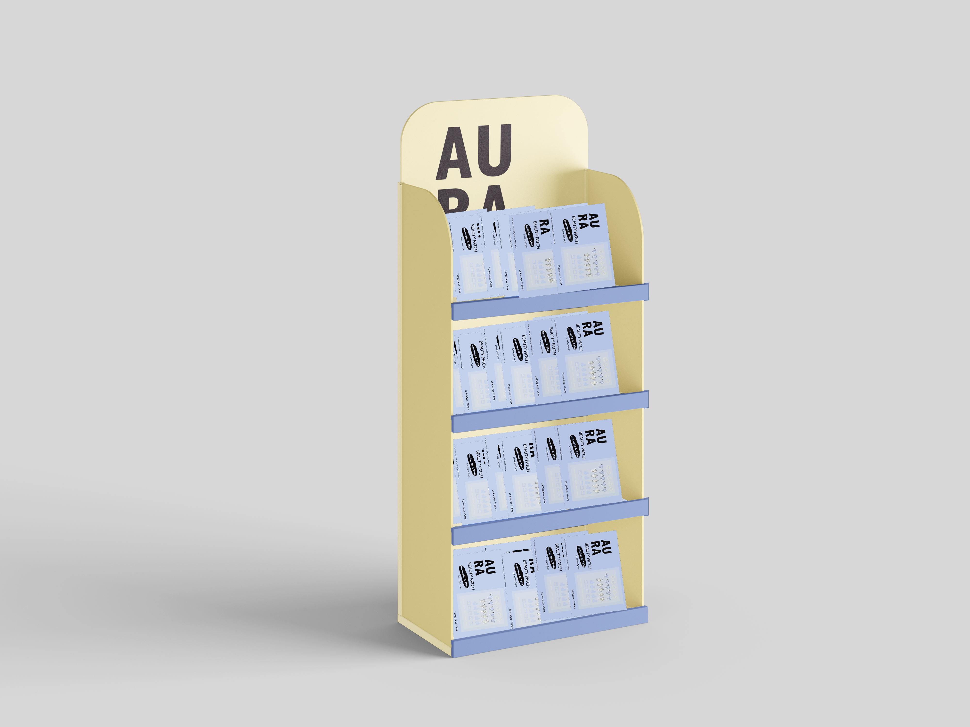


Final brand packaging design:
Outer packaging design
The unique about our packaging is the design and structure of the layout as the product comes with three is 1 use with three different sizes of pads and tampon depends on the amount of flow you are having. The color blue heavy flow, green medium flow and yellow light flow that will show at the back of the packaging with also a calendar.

Pad packaging

Tampon packaging

Inner pad packaging
.jpg)
Inner tampon packaging


Vanding Machine:

Mockup:


These three packaging above are the previous on how our packaging look like before we rearranged it as for here your eye gets confused from the logo and the subtitle and the quotation and the same time fighting what to read first.


Discussion on the redesign of the layout:
Just simple changes that needs to be done for both of the packaging for pads and tampons just the placing of the information to give it a balance structure


Exhibition:


For the exhibition above there is the two version of it the soft and delicate one and the other a balanced of both soft and bright that we have used in our packaging AURA pads.
Advertising video:
AURA advertising video
Week 7: Presentation day and Prototype
Prototype Print:


Group 4 Framework:

Feedback
Week 1
Ms. Anis said that the idea we discussed is interesting and that we should create a brand for sanitary pads the theme for sending a message to empowering woman and to give them confidence.
Week 2
Ms. Anis said for our Task 1 proposal slide presentation all the information's where there, it was just now we have to work on our deliverables for example how the packaging will look like, she also gave us some ideas and examples from our previous senior's work.
Ms. Anis said for our Task 1 proposal slide presentation all the information's where there, it was just now we have to work on our deliverables for example how the packaging will look like, she also gave us some ideas and examples from our previous senior's work.
Ms. Vitiyaa suggested some more inessentials that is related to pads and a useable vending machine in the toilet but not to make the packaging complicated but simple and easy to handle.
Week 3
---
Week 4
Ms. Vitiyaa our logo was rejected, and the ideas was also rejected the uterus shape was not allowed due to cultural sensitivity look for another way for the color scheme and packaging for the sanitary the color can be change into a more fun and exciting color instead of the red that still representing blood that will make people more embarrassed.
Week 5
Ms. Vitiyaa we can change the three inner packaging into something else for the pads and tampons
Ms. Amis the color green looks sick and is not a color that it is related to sanitary pads, but the pink can manage to work.
Week 6
Ms. V and Ms. Anis told us to use bold font for our logo keep it simple that is something is eye-catching and stands out at the same time. Week 7 print our prototype for our final presentation and make some changes to our packaging, instead of stickers they told pimple paths is much better more suitable and useful. Make the vending machine small.
Week 7
Our final project presentation was definitely a great success for my groupmates and I as both of our lecture approved and praised us for our work and prototype but just small changes that needs to be made on the packaging.
Reflections
Experience
Developing this new brand of sanitary napkins for this large project was demanding but also rewarding. Our team battled design issues and cultural sensitivities, molding and refining our ideas along the way. Miss Anis's and Miss Vitiyaa's input helped guide us in the correct direction. We initially desired a logo symbolizing female empowerment but had to revise due to cultural concerns, avoiding uterus imagery. We also learned the implications of color psychology our initial, red-themed packaging was too literal and perhaps embarrassing for users. Additionally, creating packaging, vending machines, and usability features gave us valuable hands-on product development experience.
Observations
The process taught me the importance of being culturally sensitive in design. Symbols and colors carry a lot of meaning, and therefore it is important to be sensitive to social perception. The criticism of the womb-shaped logo showed that we needed to design to be appreciated by the masses but be culturally sensitive. Our research showed that friendly, lovely packaging can reduce social stigma. Simplification from red to easily perceivable colors like blue and pink made the product more approachable. Distinction of sizes in separate colors also enhances convenience for users and is in line with current packaging trends.
Findings
My conclusion was that ideas must be refined based on feedback. While our original idea was good, color alterations, branding adjustment, and product presentation alteration greatly influenced the final result. Making the intricate logo a bold, simplified logo made brand recognition stronger and provided the packaging with more visual appeal. Collaborating with my team members improved the final product, and discussions within groups, including my mentor's recommendations, enabled us to look at the project from many different viewpoints, making it a more complete and considered work.


Comments
Post a Comment