INFORMATION DESIGN - EXERCISES 1-2 L.A.T.C.H
INFORMATION DESIGN - EXERCISES
03.02.2025 - x.x.2025 / Week 1 - Week x
Tyra Franchesca Valerie Anthony / 0368228
Information Design | Bachelor of Design (Hon) in Creative Media
Exercises
OUTLINE
INSTRUCTIONS
EXERCISES 1 - QUANTIFIABLE INFORMATION
EXERCISES 2 - L.A.T.C.H
FEEDBACK
REFLECTION
INSTRUCTIONS
ONLINE CLASS TUTORIAL
MIB
EXERCISE 1 - QUANTIFIABLE INFORMATION
Quantify raw data and visual information as a photography a representation of numerical data that allows for easy interpretation as analysis.
Requirements:
The information must be presented as is and you need to arrange the objects with relevant indicators written out with pens to help to visualize the quantity and data, the examples of objects that can be use are buttons, coins, lego pieces, M&Ms, and more.
categorize the objects based on 2 to 5 factor such as color, shape, pattern and other quantifiable characteristics.

Fig 1.1 Data

Fig 1.2 Data

For this first attempt i try to find the right angel and placement with the buttons and was giving a bit difficulty for to work with especially the smaller buttons and that are not really noticeable the clear button.

Fig 1.3 First attempt
I first started with the buttons but then the buttons were too small to arrange and rearrange also that why i choose to change and used the colored pegs that i had so many ideas to make.

Fig 1.4 Sorting Data
Colors:
Green: 8
Orange: 6
White: 10
Light Blue: 11
Deep Blue: 3
Light Pink: 9
Hot Pink: 9
Purple: 3
Yellow: 4
Red: 9
Red: 9
Black: 2

Fig 1.5 Arranging Data
Arranging the pegs in straight lines with each other to create a simplest pattern with the different colors align beside each other but for me it was not working in a creative way.

Fig 1.6 Presenting Data Visually
Then came up with the above idea which can see different patterns and placements between the pegs as some are straight and others are wavy and zigzag that is getting somewhere and then gave me the idea of the firework with this combination.

The reason why i choose too great a firework the pegs are colorful, and it will match the idea which in the photo above came like i pictured it with the color merging within each other and giving a mixer or different feeling when looking at its a combination of warm and cool color at the same time.

Fig 1.5 Draft
Final Quantifiable Information

Fig 1.6 Final Quantifiable Information
Exercise 2 - L.A.T.C.H
In the next exercise, we need to gather information into a visual poster that contains and utilize the minimum of the 4 principles. That needs to digitalize through photo editing/ illustration software with a required outcome of either a 1240 x 1750 or 2048 x 2048-pixel poster. We were also to reuse image, but we did need to create the rest of the visuals to complete the poster.
From the start i didn't know on what topic to that made me to research and find something that i find interesting and unique and also that i like, but first was thinking about food, drinks, animals, cars, many more that interest me, but nothing was coming to me for a while.
So, then the idea of sea turtle came to mind witch also brought me to my island Seychelles that we have a lot there living in the coral reefs in the marine parks that i started researching and finding some references for me to get an idea for me to create my own design.

Fig 1.2 Infographic References
The type of layout the i took a look in and see which one that i prefer that will suit my idea of the green sea turtle.
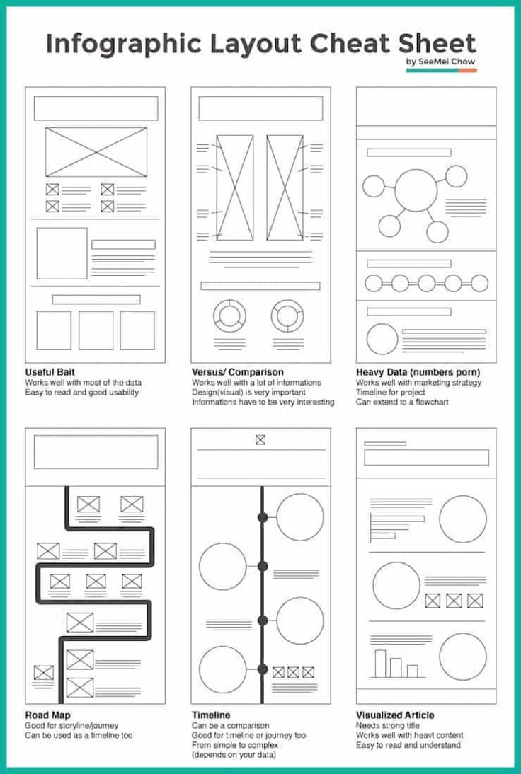


The three sketches
As the above show the idea i want to create my design with id the information about the green sea turtle their details and more but keeping it simple not complicated straight forward I want to display the weight, size and features what they eat and their treat.
First i started to find the appropriate color which i went with the different shade of green like above in the reference.

Fig 1.3 Color
As i started to find a photo of the green turtle next to the information seeing the color difference between the green and white to contrast with the light green keeping seeing if it matches team.

Fig 1.4 table information
The table layout displaying the information about the turtle to show the importance about the sea creature that for me i find it interesting that some myself i didn't know about.

Fig 1,5

Fig 1.6
My second attempt on putting the layout in landscape which came out better than i picture it to came out by using the same information from the first poster.

Fig 1.7
Putting both side by side seeing the comparison the difference they and the layout how it is.

Fig 1.8
Creating a pattern of the turtle on the that looks like they are swimming from down till the top side.

Fig 1.9
Progression:
.png)
Illustration photo 1
.png)
Illustration photo 2

illustration photo 3

Fig 1.10 1st attempt

Fig 2.1 2nd attempt
Final Outcome:

Fig 2.2 Final Outcome
Reflection
Exercise 1 (Quantifiable Information):
The first exercise was a small introduction about the topic and also module of information design it was interesting as you had to collect or get some of the objects that Mr. Fauzi gave us to use like for example: Coins, Marbles, Rubber bands, and more when finishing collect your object that will be working is to create something interesting out of it that can apply to it.
Exercise 2 (L.A.T.C.H):
The second was more on the fun side as is to create a poster base on something the is interesting and a topic of our own choice creating an Infographic poster that follow the principles of L.A.T.C.H. while i was out of ideas at first to create something there was nothing that enjoy that was coming to mind, so then i thinking i love the sea and turtles why not that. So, after researching and laying out my ideas and principles it was now to take my vision and digitalize it but first sketch the layout i want to go with if portrait or landscape both was okay i went with the second one, i took a bit of time on it which was a bit scary for me that if i don't reach on time. For the end relate i was alright with i did my best.


Comments
Post a Comment