ADVANCE TYPOGRAPHY / TASK 2: KEY ARTWORK & COLLATERAL
ADVANCE TYPOGRAPHY / TASK 2: KEY ARTWORK & COLLATERAL
22/04/2024-13/05/2024 Week 1- Week 4
Tyra Franchesca Valerie Anthony/ 0368223
Advance Typography / Bachelor of Design (Hons) in creative media / Taylor's University
Task 2: Key Artwork & Collateral
LECTURES
Task 2: Make a mind-map, create a mood board or an inspo, determine a direction and decipher it in words. Produce explorations of possible wordmark/lettering of your name (first name or pet name or pseudonym) with a minimum of at least 4-5 characters.
Showcase sketches leading to a digitized artwork
INSTUCTIONS
TASK A: KEY ARTWORK
Fig.1.1 Identity Mind map
SKETCHES
Fig 1.2 sketches idea one 20/05/2024
Fig 1.3 sketches idea two week 5 20/05/2024
Fig.1.3 Final sketch idea week 5 20/05/2024
For my first two pages of sketches was not that good because working in a rush it not good so i decided to go again in the sketch board the previous name was not giving a good approach. As the above photo i went with this one just simple and not that complicate the inspiration be hide this one was the waves within the fonts that gives it nice look to it.
Digitalize
Fig.1.4-week 7 process of the chosen bookmark
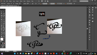
Began the process of putting the sketch in digital form was a bit difficult getting the right angle for the stroke for the waves part of the font at first was trying with pen tool was alright but then Mr. Vinod came and helped me show me an easier way by using Brush tool that helped me quickly to finished but there were some back and front for my font to get approved by Mr. Vinod but in the end was alright.
Fig.1.5 week 7 27/05/2024 process of sketches putting in digital
Fig.1.6 week 7 27/05/2024 finalizing till I final got it
The curving of the letting was giving some difficulties, and the placement also was giving an issue to get it right was more focusing on the letter T R and A as in the above photo it took me some time to get it right on both.
Fig.1.7 week 7 27/05/2024 final bookmark
As the bookmark is know well been put together and well balanced along with rest of the letterings just a little bit of arrangements will need to be made in some places of the curves to make it site well on the angel that it is in.
Fig.1.8 week 7 27/05/2024 PDF Final Bookmark
Applying Color:
I used Pinterest photo to find my color palette. As I wanted to use a warm balance palette on my project, I would like to use one of the colors below.
Fig 3.9 Chosen Color Palette Week 08 04/06/2024
Fig 3.10 Progress Week 08 04/06/2024
Keyword: Waves
Fig.3.11 Final Wordmark White Background (JPG)
Week 08 05/06/2024
Fig.3.12 Final Wordmark on Black Background (JPG)
Week 08 05/06/2024
Fig3.13 color palette (JPG) Week 08/06/2024
Fig3.14 Final Wordmark on Actual Color Lightest
shade (JPG) Week 08 08/06/2024
Fig 3.15 Final wordmark on Lightest and Darkest shade of color
(JPG) Week 08 08/06/2024
FINAL PDF RECAP
Fig.3.16 Final Task 2A Recap (PDF) Week 08
08/06/2024
TASK 2(B)
Key Collateral
Process
On these exercises, we continued from the above task 2(A) where we are going to use the key wordmark as a collateral product (Mugs, Business cards, T-shirt, ect)
Requirement:
Artwork size: 1024px x 1024px
Take a photo of ourselves in black and white
Choose 3 items for collateral and expand the key artwork
Create some simple animation GIF/ MP4 for the Wordmark
Create 9 Post for Instagram, think about the layout
For my first plan for the post, I will be creating:
3 Collateral Items
1 Self Portrait Photos
2 Wordmark in Different color
2 Patterns with the color scheme
1 Animation
1. Creating Patterns
Progression:
Process
Fig 1.1 progression of collateral
Fig 1.2 progression of second part of collateral
Fig 1.3 Final progress of collateral
Final Result
REFLECTION
Experience:
The second exercise, i understand more about function of typography by itself i want to keep simple not to complicated got inspired by surfing the waves and patterns that make when crash on the sore and taking my name and making into a logo. Had some difficulties on placing the design and layouts to make it look better i also wanted to try something new for once.
Observation:
This task has level of difficulties, is what how you will present to the client itself, maybe i should have put understanding and concept in the design. As that find other way have a creative approach on the research not just that but also surrounding of the design that will make it more balance.
Findings:
Errors and trial have been one of the most difficulties Whitin this task have to make more than just one design because when creating one other will follow as you start to think of ideas i will start to change thing and create new back and front until i get stuck on one and by taking reference also other design online and referring mine too it at first i didn't like it at all and went back to square one on the drawing board.


Comments
Post a Comment