DESIGN PRINCIPLES TASK 1: EXPLORATION


07.02.2024 - 21.02.2024 Week 1 - Week 3

Tyra Franchesca Valerie Anthony / 0368223 / Bachelor of Design (Honours) in Creative Media

Design Principles / Taylor's University

TASK 1: Exploration


Lectures

What Are the Elements of

 Design?


The principles of design, which are a set of practices of working with the elements of design that make a composition look pleasing to the eye.


LECTURES


Fig 1.1 Elements of Design Week 02 14/02/2024

  1. 1. Color: Color helps establish a mood for your composition. When light waves strike an object and reflect back to the optic nerve in a human’s eyes, the sensation they perceive is called color. Artists and designers use color to depict and describe the subject. Color is used by designers to portray mood, light, depth, and point of view. Designers use the color wheel and the tenets of color theory—a set of guidelines for mixing, combining, and manipulating colors—to create color schemes.

  2. 2. Line: Line refers to the way that two points in space are connected. Whether they’re horizontal lines, diagonal lines, or vertical lines, lines can help direct the eye toward a certain point in your composition. You can also create texture by incorporating different types of lines such as curved or patterned lines instead of just straight lines.

  3. 3. Value: In design, value refers to the lightness or darkness of a color. The values of a color are often visualized in a gradient, which displays a series of variations on one hue, arranged from the lightest to the darkest. Artists can use the various values of color to create the illusion of mass and volume in their work.

  4. 4. Space: Making proper use of space can help others view your design as you intended. White space or negative space is the space between or around the focal point of an image. Positive space is the space that your subject matter takes up in your composition. The spacing of your design is important because a layout that’s too crowded can overwhelm the viewer’s eye.

  5. 5. Shape: In its most basic form, a shape is a two-dimensional area that is surrounded by an outline. Graphic artists can use other elements including line, color, value, and shadow to give a shape the appearance of a three-dimensional shape. There are three types of shapes: organic shapes which occur naturally in the world, geometric shapes which are angular and mathematically consistent, and abstract shapes that represent things in nature but aren’t perfectly representative.

  6. 6. Form: Form pertains to the way that a shape or physical configuration occupies space. Instead of creating form through three-dimensional physical shape, designers create the appearance of form on a flat surface by using light, shadow, the appearance of an object’s contours, negative space, and the surrounding objects around the subject matter.

  7. 7. Texture: Texture is one of the elements of design that is used to represent how an object appears or feels. Tactile texture is a physical sense of touch, whether it’s rough, smooth, or ribbed. Visual texture, on the other hand, refers to the imagined feel of the illustrated texture, which can create more visual interest and a heightened sensory experience.


There are twelve basic principles of design: 
contrast, balance, emphasis, proportion, hierarchy, repetition, rhythm, pattern, white space, movement, variety, and unity. These visual and graphic design principles work together to create appealing and functional designs that make sense to users.


INSTRUCTIONS

TASK 1

For our first task that we have been given to out the instructions into our blogger and our research with also to select a goal example below.

Fig 1.2 the descriptions for the first task 1 05/02/2024

1. CONSTRAST


Contrast refers to an obvious difference between two or more things. It highlights the disparities or divergences between them. For instance, you might appreciate the contrast of white trousers against a black jacket or notice the marked contrast between two individuals’ characters.

2. BALANCE


Achieving visual equilibrium is essential. Balance can be symmetrical (equal weight on both sides) or asymmetrical (unequal but visually balanced). It prevents designs from feeling lopsided or chaotic.


3. EMPHASIS


Used to make certain parts of an Artwork stand out, it creates the center of interest or focal point.  It is the place in which an Artist draws your eyes to first.

4. MOVEMENT


How the eye moves through the composition, leading the attention of the viewer from one aspect of the work to another.  Can create the illusion of action.

5. GESTALT THEORY


What are the Gestalt Principles? Gestalt principle is a set of guidelines that deal with how the human brain perceives the world around them: simplifying, organizing, 

6. REPETITION


  1. Repetition: Repetition reinforces consistency. Repeating visual elements (such as shapes, colors, or patterns) ties a design together.


7. SYMBOL


Is a visual representation that communicates a specific idea, concept, or meaning. Symbols are often can be seen on mostly as a company logo or a wat of passing a message but in a simpler way.

8. HARMONY & UNITY


The seventh and eighth design principles are Harmony and Unity. Harmony in art involves combining similar design elements — related or comparable colors, textures or shapes — for a pleasing, satisfying effect. The opposite of harmony is dissonance, which can be quite jarring. Musicians make harmony by adding tones above or below the melody to support or enhance the melody. Adding different harmonies to a melody line can change the tone or mood of the entire piece.

9. WORD AND IMAGE

word and image design. These principles guide designers in creating effective and visually appealing compositions.


2. UNSDG Goal 

We were required to select one goal out from the 17 we have been provided to choose from.  As is have observed the goals and I have chosen 14: Life under water.


This is a small example of the life under water what is based on and what is trying to say a bit on the health of the ocean also mostly about the animals and environment.

I choose the life under the sea because I love the ocean and the animals living in it but with don't realize that we are destroying and affecting it by troughing our waist in the ocean itself that we also get affected.

This is a small article about the life below the sea mostly explain why and how it matters that the creatures in the below are important also and just by troughing just waist and killing them.


Fig 1.3 inspiration artwork 13/02/2024 
Name of Artist: Jenna Wellein
Artwork: Rising 
Link: https://i.pinimg.com/564x/46/28/36/4628368b46bee95d23d213a8694230dd.jpg

As the artwork expressing movement within the colors as the gradient from light to dark as if it flows like are in the ocean on the calmness of the waves peaceful mind.

There are no other words to explain the art after seeing it.


An inspiration from the SDG goal below the water is like the van Goghs art the movement in the artwork that capture my eyes because I was looking for that but mostly, I want also to pass a message to the audience.

For examples in the article there are different way of showing an artwork painting, design, mural and more but most common is RecyClean the trash on the sore to create an artwork piece with.


Fig 1.4 Vincent Van Gogh 'The Starry Night' 
Name: Vincent Van Gogh 
Artwork: Starry Night 
Year: June 1889
Material: Oil painting 
https://www.pinterest.com/pin/6192518230661369/


As I got inspired by the artist Vincent Van Gogh of the artwork the starry night as reference photo above the same as the artwork that I have chosen with flowing movement in the painting as you can see in the night sky with the stars showing a calm flow in the painting as the night is bright as the moon is shining above the village, as I am looking at the painting I feel like floating in the clouds as the starts and moon continue to shine.  

A bit of history of the Artwork "The Starry Night"

“The Starry Night” is an iconic oil-on-canvas painting by the Dutch Post-Impressionist artist Vincent van Gogh. Created in June 1889, it captures the view from the east-facing window of van Gogh’s asylum room at Saint-Rémy-de-Provence, just before sunrise. The painting features an imaginary village alongside the mesmerizing night sky.

Here are some key details about this celebrated work:

  1. Description:
    • The canvas is dominated by a night sky swirling with chromatic blue patterns, a glowing yellow crescent moon, and stars depicted as radiant orbs.
    • Cypress trees, often described as flame-like, stand tall in the foreground, their dark branches curving and swaying against the dynamic sky.
    • In the distance on the lower right, a structured village appears. Straight lines define the small cottages and the slender steeple of a church, creating a sense of calm amid the turbulence.
  2. Context and Creation:
    • Van Gogh painted “The Starry Night” during his 12-month stay at the Saint-Paul-de-Ma

      usole asylum
       near Saint-Rémy-de-Provence, France.
    • His productivity alternated with moments of despair during this period.
    • Although limited to the subjects around him, van Gogh’s style remained unrestricted. He experimented with depicting various weather conditions and changing light, capturing nearby wheat fields under both bright summer sun and dark storm clouds.
    • The challenge of portraying a night landscape intrigued him, leading him to explore the vibrant colors of the night sky and the luminosity of stars.
  3. Legacy:
    • “The Starry Night” is one of van Gogh’s late masterpieces, showcasing his distinctive style and emotional intensity.
    • Its swirling forms and expressive use of color have made it an enduring symbol of creativity and the human experience.


ANOTHER ARTIST 

I want to incorporate another artist for my work I want to mix my work with different principles for example patterns and movement and the other artist i choose is Maurits Cornelis Escher a DUTCH artist that those pattern repetitions.  But he was most known for printmaking.


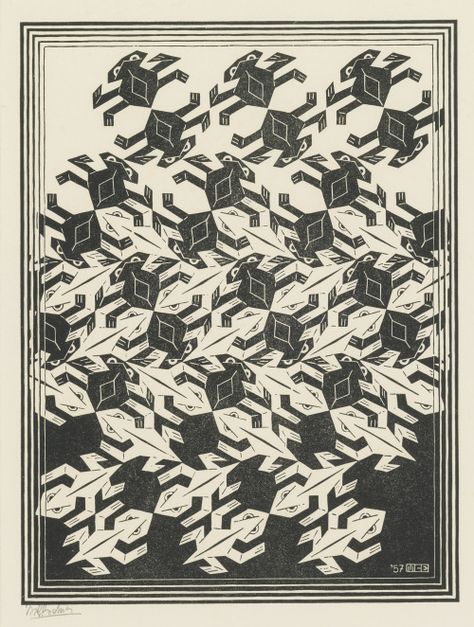
His work features mathematical objects and operations including impossible objects, explorations of infinity, reflectionsymmetryperspectivetruncated and stellated Polyhedrahyperbolic geometry, and tessellations. Although Escher believed he had no mathematical ability, he interacted with the mathematicians George PólyaRoger Penrose, and Donald Coxeter, and the crystallographer Friedrich Haag, and conducted his own research into tessellation.

Early in his career, he drew inspiration from nature, making studies of insects, landscapes, and plants such as lichens, all of which he used as details in his artworks. He traveled in Italy and Spain, sketching buildings, townscapes, architecture and the tilings of the Alhambra and the Mezquita of Cordoba, and became steadily more interested in their mathematical structure.


ESCHER famous artwork 


Name: M.C. Escher
Art: Regular division of the plane 
Media: Hand Drawn lithograph
Year: 1957
Link: https://www.pinterest.com/tyraanthony02/artist/
 

REFLECTION

EXPERIENCE

I've gain knowledge of design principles the different elements for examples contrast, balance, alignment, repetition, and harmony and more. These elements play a different role in the visual appealing of artwork.

As for we have to choose an (UNSDG) goal i went with 14 " life under water". My attention was taken from when i saw this one which also plays a big part me from where i came from.

OBSERVATION

Being observant is very important in design principles having an eye of an artist yourself capturing every small detail in artwork or design and understanding their point of view. For what i have comprehend design principles is in our everyday life.

FINDINGS

Design principles is by just learning the basic as also applying them throughout your works creating effective visual communication to the audience.


FEEDBACK 

Week 1

For my Task 1 exercise went to show Dr. Charles my work for the for task he really liked my ideas when I told him that I got inspired by the Artist Vincent van Gogh "The Starry Night" as I was explaining him what the Design principles, I see in the artwork and telling me a better way to express by the words am saying to saw the audience what am seeing.

Comments

Popular posts from this blog

TYPOGRAPHY 1- EXERCISES

ADVANCE TYPOGRAPHY

Illustration & Visual Narrative Task 1